
Opportunity
Idea
Identity
Before / After
Packaging
Café
Film
Digital
Shift your day

01 — Concept rebrand · coffee + hospitality
Upper
Cup
A better cup.
A better moment.
Concept rebrand
Creative direction + brand design
Strategy → identity → campaign
2026
Upper Cup is a concept rebrand that transforms the neighborhood coffee experience into a warmer, more expressive and contemporary lifestyle brand. The new identity combines approachable design, thoughtful hospitality and everyday storytelling to position Upper Cup as more than a place to grab coffee — it becomes part of the customer’s daily rhythm.

The badge, on the cup it’s named for
Act one
Rethink
The opportunity, the challenge, the idea and the strategy — everything decided before a single mark was drawn.
02 — The original opportunity
Upper Cup already had the foundation of an approachable neighborhood coffee brand. The opportunity was to build a stronger visual identity, a clearer personality, and a more cohesive experience across every physical and digital touchpoint.
Nothing here is a critique of what came before. The existing brand worked as a sign over a door. It just wasn’t doing any work once you were inside, on the cup, on the counter, on the phone, or in anyone’s memory the next morning.
Project type
Concept rebrand
Sector
Food + beverage · hospitality · retail
Role
Creative direction + brand design — sole author
Scope
Strategy, identity, packaging, environmental, digital, campaign
Structure
Three acts: rethink, rebuild, bring it to life
More distinctive
An ownable mark that reads as Upper Cup and nothing else, at 9 feet or 9 millimetres.
More contemporary
A system that feels current without chasing a trend that dates in eighteen months.
More emotional
Language and imagery built around how the cup makes you feel, not what’s in it.
More memorable
A pattern, a palette and a voice consistent enough to recognise from across the street.
03 — The challenge
How might we
Turn Upper Cup from a place people buy coffee into a brand people make part of their everyday routine?
Coffee shops don’t compete on the drink. By the third visit, nobody is comparing extraction, they’re choosing atmosphere, convenience, familiarity, community, and how twenty minutes in that room makes
them feel.
Which means the brand has to carry things a logo can’t: the greeting at the counter, the message on the cup, the tone of a push notification, the reason you’d walk two blocks further. Upper Cup needed a system capable of communicating all of it in one voice.
04 — The big idea
Shift your day.
Coffee is rarely about coffee. It’s a transition, the small ritual that moves you from one version of the day into a better one.
That’s the promise the whole system is built to deliver.
Tired
Focused
Slow
Moving
Disconnected
Present
Morning
Ready
Start somewhere better.
Your day starts here.
Find your upper gear.
A little lift goes a long way.
Coffee for whatever comes next.
05 — Rebrand strategy
Three pillars,
every decision.
Each one is a filter. If a cup message, a sign or a screen doesn’t answer to one of them, it doesn’t make the build.
Positioning framework
Pillar 01
Warmth
Genuinely welcoming rather than over-polished or corporate. The palette is roasted and creamy, the type has a hand to it, and the copy sounds like a person who already knows your order.
Pillar 02
Energy
Capture the lift people associate with the first cup of the day. That’s the rays above the cup mark, the rust accent, the checkerboard, motion built into a static system.
Pillar 03
Community
A familiar neighborhood destination where customers feel recognised. Staff aren’t scripted ambassadors, the walls carry local work, and the loyalty card is a punch card, not an algorithm.
06 — Brand positioning
The neighborhood coffee shop that helps you get into your day.
The corporate chain
Fast · consistent · anonymous
The precious specialty café
Exacting · reverent · intimidating
Upper Cup sits here
Elevated
but approachable
Designed
but comfortable
Contemporary
but familiar
Energetic
but never chaotic
07 — Audience
Four routines,
one room.
Not demographics — routines. Each one is a design constraint somewhere in the café, the menu or the app.
Personas → floor plan
The Creative
Usual: cold brew, extra shot
Laptop open, headphones nearby, coffee within reach. Stays two hours, buys twice, and needs an outlet more than they need a second sofa.
The Commuter
Usual: large drip, oat, to go
Quality, consistency and speed before work. Orders on the app from the corner and wants the cup on the shelf by the time the door closes behind them.
The Regular
Usual: they don’t have to say it
Knows the barista’s name and has a usual. The whole loyalty system exists to make sure this person feels recognised rather than processed.
The Connector
Usual: two cappuccinos, one table
Uses Upper Cup for meetings, conversation and community. Needs a table that seats four, a room quiet enough to talk, and a reason to book it again.
Act two
Rebuild
The identity, the system it sits inside, and every surface it had to survive from a 9-foot sign to a 9-millimetre stamp.
08 — Identity transformation
A cup, and
the lift above it.
The refreshed identity balances personality and simplicity — a more recognisable
presence while keeping the warmth expected from a neighborhood coffee shop.
The mark is a cup with rays coming off it: the drink and the feeling in one drawing.
Badge · vertical · horizontal · mark · reversal · small scale

Primary — the badge

Vertical lockup — stacked
Horizontal — signage, web, wide

The mark — standalone icon

Alternate — single-color cup
09 — Before + after
From functional
to felt.
The rebrand moves Upper Cup from functional coffee branding toward a complete lifestyle experience.
Before panel is an indicative reconstruction


A FRESH LOOK. THE SAME COMMUNITY SPIRIT.
Upper Cup’s rebrand builds on what makes the café meaningful: thoughtfully roasted coffee, familiar faces, and connections formed over a shared cup. The new identity brings that welcoming spirit into a bolder visual expression, creating a consistent experience across the café, packaging, merchandise, and mobile coffee service.
The original logo introduced a playful personality through expressive lettering, eye details, and a light blue cup. The new design carries that character forward with subtle facial marks, a warmly illustrated cup, and golden rays that give “Get Lifted” a visual expression.
Dimension
Before
After
Identity
A name set in a serviceable typeface. Correct, but not ownable.
A badge, a vertical, a horizontal and a standalone mark — a family that scales from cup lid to storefront.
System
Logo and a color. Every new piece was a fresh decision.
Palette with defined emotional roles, two checkerboards, a floral tile, a stamp set and an icon library.
Voice
Functional. “Your order is ready.”
Warm and conversational. “Your cup is up.” One voice from counter to push notification.
Experience
A place to buy coffee.
A daily ritual, designed end to end — café, cup, screen and campaign.
A note on honesty: the before panel is an indicative reconstruction representing the category default this rebrand moves away from, not a reproduction of any existing Upper Cup artwork. Everything on the after side is the actual redesign.
WHY THE NEW LOGO WORKS
Clearer recognition. Bold “UPPER CUP” lettering gives the name a stronger presence, while a straightforward “COFFEE COMPANY” line makes the offering easier to identify than the original’s small curved text.
A warmer welcome. Espresso brown, cream, burnt orange, and gold connect the identity to coffee, warmth, and the everyday comfort of gathering.
Personality with continuity. The cup and subtle eye details preserve the original logo’s playfulness while giving Upper Cup a distinctive character to build upon.
A symbol of uplift. Rays rising from the cup suggest morning light, energy, and optimism reinforcing the idea that a visit can brighten someone’s day.
More ways to connect. The cup mark, wordmark, and badge variations give the brand flexibility across storefront signage, cups, coffee bags, apparel, and social media.
10 — Color system
Five colors,
five jobs.
Every color earns its place by doing an emotional job, not by filling a slot in a swatch grid.
Roast and cream carry the brand; rust and gold create the lift; sage cools it down so the warmth never tips into sticky.
Roles, not swatches
First Pour
#28110D
Sophistication and contrast. The reversal ground, the signage, the counter face. Deep enough to make the cream read as light rather than beige.
Copper Kettle
#C16328
Energy and recognition. The signature accent — checkerboard, floral tile, saucer, campaign. This is the color you’d spot from across the street.
Golden Crema
#CF9D2E
The lift. Reserved for the rays above the cup and for moments of arrival — “your cup is up”, rewards, the end card.
Sunday Sage
#667052
A muted olive green that brings earthy warmth and the calm of a slow Sunday morning.
Coffeehouse Clay
#947B68
Comfort and simplicity. The ground everything sits on, warm enough that paper cups and kraft bags look intentional rather than cheap.
Morning Mist
#9DB9B8 — Sage, the cooling secondary
A soft blue-green that captures the quiet freshness of an early morning.
Oak Milk
#EBE1C8 — Paper, the digital ground
A warm, creamy neutral that brings comforting softness to every touchpoint.
11 — Typography
A fat face
and a clear one.
The wordmark is a high-contrast display serif with real weight to it so the supporting system stays plain on purpose.
One expressive face for the things people feel, one geometric sans for the things people need to read.
3 faces · defined jobs
PRIMARY FONT

bodoni moda black — headlines, cup messages, campaign
SECONDARY FONT

made tommy uppercase — moments of arrival and warmth
body font

made tommy — menus, digital, informational copy
ACCENT FONT

BASSY — menus, digital, informational copy
ALTERNATE ACCENT

bodoni moda semibold italic — menus, digital, informational copy
Utility
ORDER 0412 · SHELF 2 · EST 2010
DM Mono — order codes, labels, wayfinding, price rails
Get up.

12 — Graphic language
The parts that
aren’t the logo.
This is what turns an identity into a system. Two checkerboards, a retro floral tile, a stamp set and an icon library,
enough vocabulary to design a napkin, a wall or a story frame without ever repeating a layout.
Patterns · stamps · icons
Rust checkerboard — primary pattern
Sage checkerboard — secondary, cooling
Retro floral tile — wall, sleeve, social

UPPER CUP PATTERN - Geometric stars

UPPER CUP PATTERN - LATTE BLOOM

UPPER CUP PATTERN - SAGE LATTICE

UPPER CUP BACKGROUND - KRAFT

UPPER CUP BACKGROUND - SPECKLED

UPPER CUP BACKGROUND - CORRUGATED KRAFT


UPPER CUP ICON SYSTEM
13 — Photography direction
Real people.
Real routines.
Really good coffee.
The photographic world matters more than usual here, because the whole brand idea lives in an ordinary moment.
Overly staged coffee advertising would undo the strategy in a single frame.
Art direction rules
Reference frame — warm key, close detail, real surface
Always
Warm natural light, morning or late afternoon
Urban neighborhood settings you could actually find
Realistic customers, candid interactions
Close-up coffee detail — crema, foam, steam
Hands, cups, laptops, books, pastries
A little mess. Rings on the table are fine.
Never
Studio white sweep or seamless backdrops
Perfect latte art as the hero of every frame
Models holding cups they clearly aren’t drinking
Cool blue grades or clinical daylight
Overhead flat-lays with props arranged in a grid
Anyone laughing alone at a salad, coffee edition
Grade toward the palette: lift the warms, hold the shadows brown rather than black, never let the highlights go blue.
14 — Packaging system


The cup does
the talking.
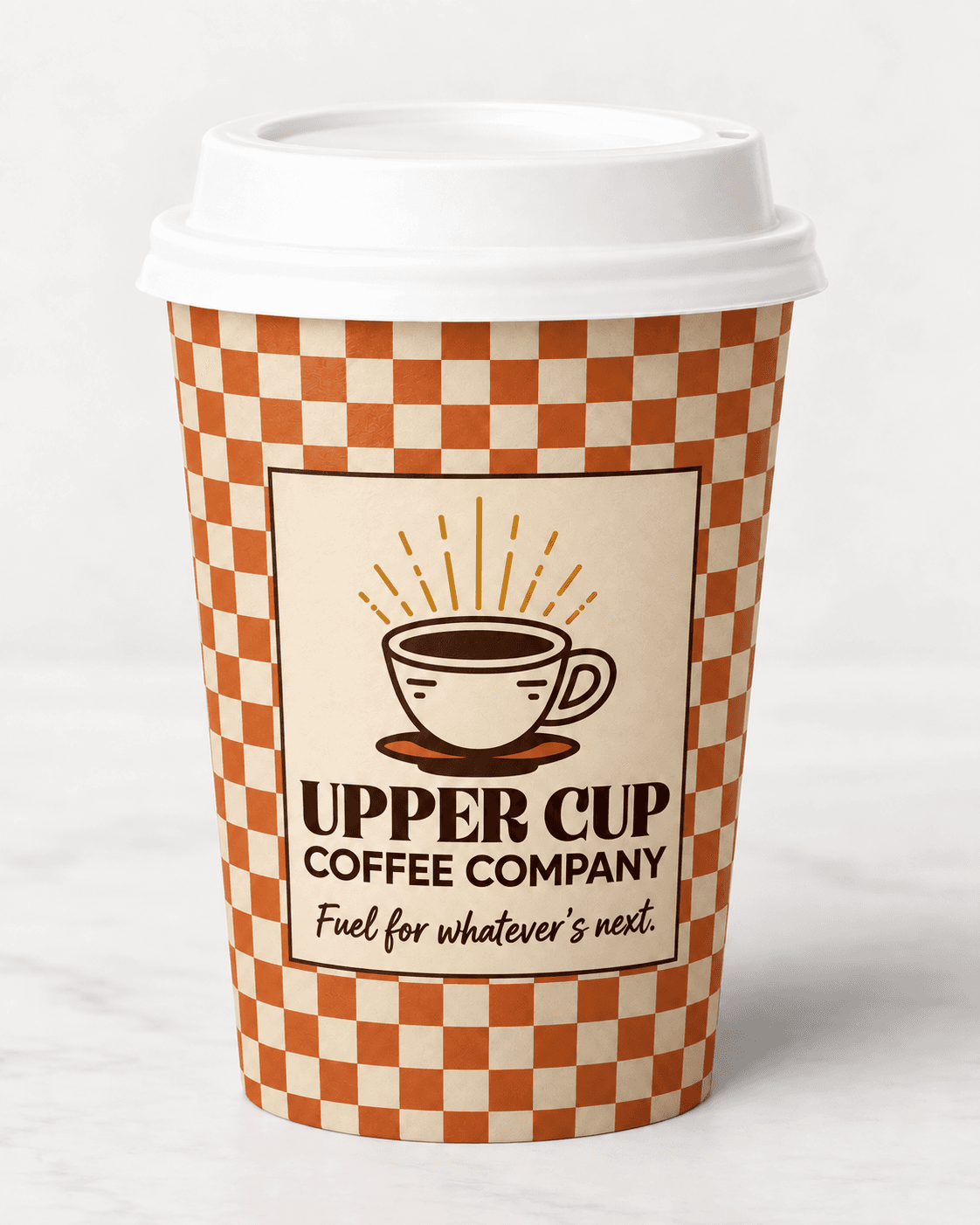
A coffee brand’s biggest billboard is a twelve-ounce paper cup carried through a neighborhood.
Every piece carries the badge, one line of voice, and nothing else competing for the space.
Cups · sleeves · bags · utensils · stickers

Wooden utensils — hot-stamped

Wooden utensils — hot-stamped
Wooden utensils — hot-stamped

Wooden utensils — hot-stamped
Cup messaging
Four lines, printed in runs, so a regular collects the set over a month, which is the cheapest loyalty mechanic there is.
You’ve got this.
Sleeve 01
Take it from the top.
Sleeve 02
Fuel for whatever’s next.
Sleeve 03
Your Upper Cup is full.
Sleeve 04
15 — Menu system
Four columns.
No decoding.
The board is the first thing a new customer reads and the last thing a regular looks at.
Four plain categories, prices in mono on a rail, nothing set in a script anyone has to squint at.
Board · print · mobile · counter

Coffee
Espresso
3
Americano
4
Cappuccino
5
Latte
5
Cold brew
5
Drip
3
Specialty
The Upper Cup
6
Maple cortado
6
Brown sugar shaken
6
Seasonal pour
7
Affogato
7
Tea + More
Loose leaf tea
4
Matcha latte
6
Chai latte
5
Hot chocolate
5
Lemonade
4
Bites
Morning pastry
4
Breakfast sandwich
8
Avocado toast
9
Banana bread
4
Grab-and-go
6
The Upper Cup — our signature. Double shot, brown butter, oat.
16 — Environmental branding
The room is
the brand.
Identity stops being decoration the moment it has to move people through a space.
The checkerboard does the heavy lifting, awning, floor, counter face, so the badge only has to appear where it counts.
Storefront · counter · window · wall · pickup

Storefront — checker awning

Order counter — badge + sage checker base

Window graphics

Wall graphic

led screen Pickup counter

Wi-Fi card — table tent
26

Retail merchandising bay
27
17 — Customer experience
Walk in. Order.
Connect. Reset. Go.
Five stages, and the brand has a job in each one. This is where the rebrand stops being graphics and starts being service design.
Service journey
Stage 01
Arrive
Familiar and welcoming. The checker awning does the recognition before anyone reads the sign.
Stage 02
Order
Four plain columns, no decoding. A new customer orders confidently on their first visit.
Stage 03
Stay
Work, meet, think or recharge. Power at every seat and a table that seats four.
Stage 04
Reset
The cup does its actual job. Somewhere in here the day turns a corner.
Stage 05
Go
Out the door a little more prepared for whatever comes next. Punch card one closer.
Act three
Bring it to life
People, campaign, film, social and screen — the places a brand stops being a system and starts being a habit.
18 — The people behind the brand
Hospitality has
a face.
Most branding case studies stop at the cup. But the single biggest brand asset in a neighborhood café is
the person handing it to you, so the system defines them the same way it defines a color.
Staff character · service standard

Portrait frame — casting & shoot pending
Darren
Upper Cup barista · shift lead
Upper Cup employees aren’t scripted brand ambassadors, they’re part of the neighborhood. Warm, knowledgeable, observant, and comfortable with people. Darren knows the Creative takes an extra shot on Thursdays and that the Connector needs the four-top by ten.
The brand gives him language rather than a script: “Let’s get into it” instead of “good morning”, “your cup is up” instead of “order ready”. Everything he says is something a person would actually say, which is the entire point of the voice system.
D — Deliver a warm welcome. Make every guest feel at home.
A — Ask and listen. Learn their tastes and preferences.
R — Recommend with care. Help them find their perfect cup.
R — Respect every detail. Get their order right.
E — Elevate the experience. Add a thoughtful personal touch.
N — Nurture the connection. Thank them and invite them back.
Warm
Quick-witted
Calm
Approachable
19 — Advertising campaign
Sometimes all
you need is an Upper Cup.
The campaign dramatises the shift. Not that coffee fixes your life, that the smallest ritual can change
the direction of a morning, which is a far more honest and far more relatable claim.
Endline · OOH · social · digital
Before
Slow.
Distracted.
Unmotivated.
Desaturated, cool, handheld. The morning everyone recognises.
After
Focused.
Energised.
Ready.
Warm key, steadier frame, rust and gold enter the palette.
A little lift goes a long way.
20 — Commercial / film
Upper Cup —
“The Shift”
A :60 spot in six frames. One character, one morning, one cup, no dialogue until the end card. The grade carries the story: the film gets warmer as she does.
:60 spot · six-frame board

SC 01 — INT. APARTMENT · 7:10AM
Nicole, still not in it yet
Cool grade, handheld, no music. Four seconds of a morning everyone has had.

SC 02 — EXT. UPPER CUP
She pushes the door open
First warmth in the frame. The checker awning fills the top third.

SC 03 — INT. COUNTER
Darren already knows the order
One line of dialogue: “The usual?” The recognition is the product.

SC 04 — MACRO
First sip
Hold on the badge in the foam. The only hero shot in the spot.

SC 05 — INT. DESK · 9:20AM
Working. Actually working.
Warm key now, steady frame. Same person, different gear.
SC 06 — END CARD
Shift your day.
Mark, line, nothing else. Four seconds, no voiceover.
The campaign uses an everyday transformation to communicate the emotional value of the brand: sometimes the smallest ritual can change the direction of your day.
Frames above are the storyboard — production stills to follow.
A Little Lift
A coffee commercial about the small shift that can change the whole day.
For Upper Cup’s brand film, A Little Lift, the story follows Nicole through a morning that starts a little heavy. A familiar café, a barista who already knows her order, and that first sip become the reset she didn’t know she needed.
Built around quiet, everyday moments, the commercial brings Get Lifted. Stay Grounded. to life through warmth, humor and human connection. Because sometimes you don’t need to have the whole day figured out. You just need a place to start.
21 — Social media
Alive, not
archived.
The launch feed runs on a fixed rhythm, product, people, voice, culture, so the grid holds together
at thumbnail size and the account reads like a café rather than a brand guidelines PDF.
SOCIAL MEDIA

22 — ENVIRONMENTAL experience
Good morning.
What’s your Upper Cup?
Upper Cup takes your daily pick-me-up on the road. Our mobile coffee shop brings freshly brewed coffee, handcrafted favorites, and a warm welcome to events, neighborhoods, and wherever your day takes you.
Order · FOOD TRUCK · pickup · rewards


22 — Merchandise
Lifestyle first.
Logo second.
Nobody wears a coffee shop’s logo. They wear a line that says something about them, so the merch leads with the joke and lets the mark sit small on the back of the neck.
Apparel · totes · mugs · pins
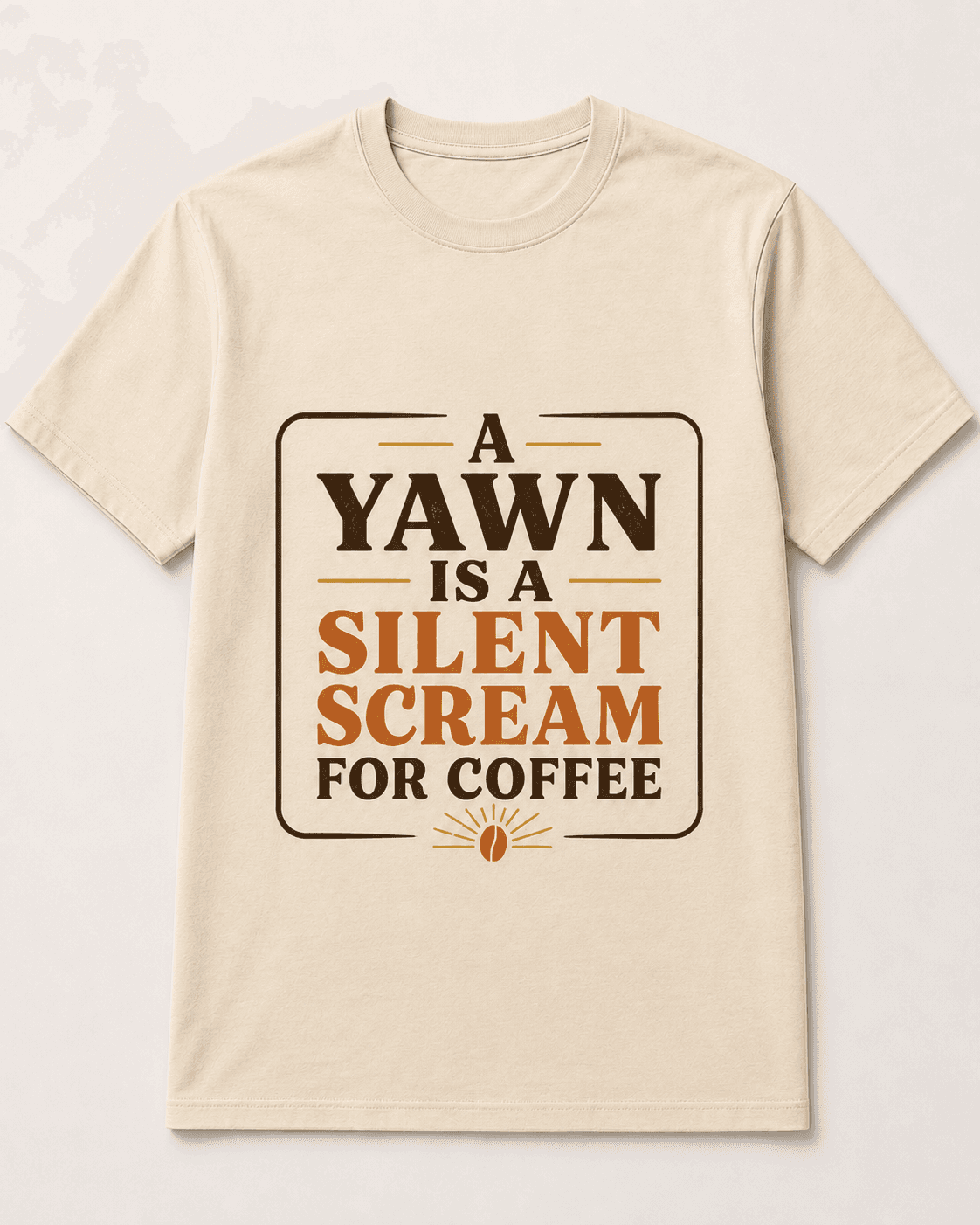
upper cup - t-shirt

upper cup - tote

upper cup - refill tin
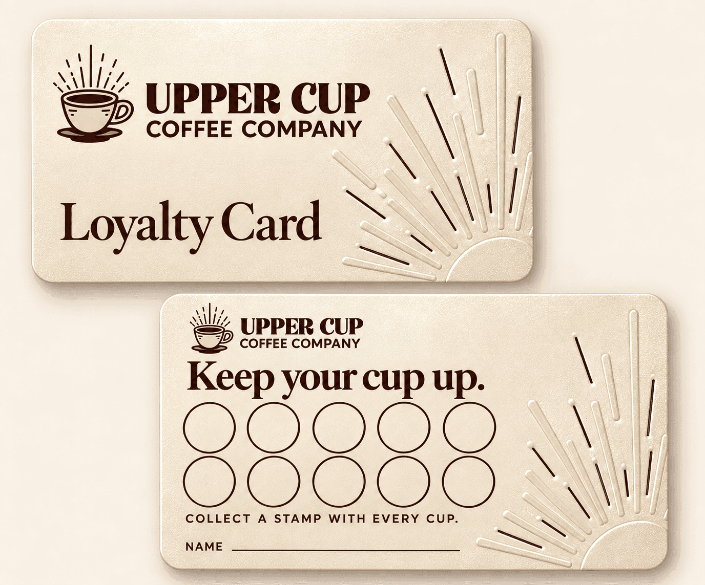
upper cup - loyalty card

upper cup - coffee packaging

upper cup - small run ceramic pour-over

upper cup - t-shirt

upper cup - stickers
24 — Brand voice
Say it like
you’d say it.
One rule: never let the café talk like a system. Every functional message got rewritten as something
Darren would actually say across a counter and then that language went everywhere, including the app.
Copy system · counter, cup, screen
Instead of
Your order is ready.
Say
Your cup is up.
Instead of
Good morning.
Say
Let’s get into it.
Instead of
Thanks for visiting.
Say
Same time tomorrow?
Instead of
Need coffee?
Say
We thought you might.
Warm
Clever
Encouraging
Conversational
25 — Rebrand applications overview
A 360°
rebrand.
Six disciplines, one voice. Every artifact on this page comes out of one of them.
Strategy through campaign
01
Strategy
Opportunity, challenge, big idea, three pillars, positioning against the chain and the specialty café, four audience routines, and the voice system.
02
Identity
Badge, vertical, horizontal, standalone mark, alternate lockup, one-color and knockout, small-scale rules, patterns, stamps and icons.
03
Packaging
Hot cups, cold cups, rotating sleeve messages, retail bean bags, pastry bags, napkins, branded utensils, stickers and carry trays.
04
Environment
Storefront and awning, exterior sign, window graphics, order counter, menu boards, wall graphic, pickup shelf, Wi-Fi card, retail bay.
05
Digital
Mobile ordering, customisation, pickup, punch-card rewards, plus the social system and content templates.
06
Campaign
“The Shift” — the :30 spot, endline, OOH, posters, digital, and the staff character work that makes the hospitality claim credible.
26 — Rebrand goals
No invented
results.
A concept rebrand has no sales lift to quote. What it has is three problems it was built to solve
and whether the system solves them is visible on this page.
Concept — not a client engagement
Goal 01
Differentiate
Build a stronger, ownable visual identity in a category where almost everything looks like everything else.
Goal 02
Humanize
Anchor the brand in real customer routines and genuine hospitality rather than craft-coffee performance.
Goal 03
Connect
Extend one cohesive experience from café to cup to screen to campaign, with nothing that feels borrowed.
1 cup
can change
1 moment
which can change
your day
Your day is
looking up.
The Upper Cup concept rebrand transforms an everyday coffee stop into a warm, recognisable lifestyle experience combining brand strategy, identity, packaging, environment, digital design and storytelling around the simple ritual of getting into your day.
Strategy • Creative direction • Identity • Packaging • Environmental • Digital • Campaign
Not a coffee shop
redesign.
A concept rebrand exploring how strategy, identity, hospitality and storytelling can reposition a neighborhood coffee shop around the emotional role coffee plays in people’s everyday routines. Sole author, every phase — rethink, rebuild, bring it to life.
Start the conversation
Upper Cup — concept rebrand
Shené Brownlee © 2026 · Imagine Reign Creative Studios
Back to top ↑