Dessert bar

For the craving that wants something warm, loaded and slightly ridiculous.
Grazing & boards

For the craving that wants salt, texture and a table built in front of you.
/
01 — Concept brand · food + beverage · retail
Sweet Fix / Savory Fix
Whatever you’re craving, there’s a fix for that.
Self-initiated concept
Creative direction + brand design
Dual-brand architecture
2026
A playful food concept built around one universal truth: sometimes you just need to satisfy the craving. The dual-brand system creates two complementary experiences — one indulgently sweet, the other unapologetically savory — under one memorable brand idea.
02 — Project overview
Sweet Fix / Savory Fix explores how one brand can serve two completely different cravings while staying unmistakably one thing. Through complementary visual systems, packaging, menus, environmental graphics and playful messaging, the concept turns choosing what to eat into part of the experience.
Sector
Food + beverage · hospitality · retail
Project type
Self-initiated concept brand
Role
Creative direction + brand design — sole author
Scope
Strategy, identity, packaging, environmental, menu, campaign, digital
Structure
Two sub-brands under one master concept: FIX
03 — The challenge
How might we
Create one memorable food brand that can satisfy two completely different cravings?
People don’t want food in general — they want a specific thing, right now. Yet almost every food concept commits to one category and asks the customer to be in the right mood for it. The opportunity was to build two personalities distinct enough to stand alone, but connected enough that neither feels like a spin-off.
Too much difference and it’s two unrelated businesses sharing a landlord. Too little and the sweet side reads as an afterthought. The whole design problem lives in that gap.
Warm, loaded, nostalgic
Sweet Fix
vs.
Salt, herb, texture
Savory Fix
04 — The big idea
Pick your fix.
One question the customer is already asking themselves, turned into the brand platform. Every headline, every sign, every screen is a version of it — and the answer is always available in both directions.
Sweet mood? Sweet Fix.
Savory mood? Savory Fix.
Can’t decide? Get both.
What’s your fix?
Craving solved.
Fix incoming.
One craving at a time.
05 — Brand architecture
One master concept.
Two front doors.
Who We Are
We are Sweet Fix and Savory Fix, two playful food experiences made for unforgettable gatherings. Sweet Fix brings the sugar rush, while Savory Fix brings the bold, artisan flavor.
What We Do
We create live dessert stations, customized treats, grazing tables, charcuterie boards, appetizers, and small bites. Guests can choose their flavors, toppings, sauces, cheeses, fruits, and finishing touches while watching their food come together in real time.
Where It Is Done
We bring the experience directly to you. Our beautifully designed setups are perfect for weddings, birthdays, showers, corporate events, community gatherings, private parties, venue partnerships, and brand activations, whether indoors or outdoors.
Why We Love It
We love turning food into an experience. From the colorful presentation and custom details to the hands-on interaction and shared excitement, every fix is made to be photographed, enjoyed, and remembered. Choose Sweet Fix, Savory Fix, or both, because every gathering deserves something worth talking about.
Endorsed sub-brand model
What stays constant
The script hand, the word Fix, the SF monogram, the circular badge construction, the cream ground, and the voice. A customer should recognise the family before they read a single word.
What’s allowed to change
Color, ornament, pattern and product language. Sweet gets the heart, the plaid and the cranberry; Savory gets the wheat sprig, the herb pattern and the forest green. Neither borrows the other’s.
06 — Three brand pillars
Three filters,
every decision.
If a menu item, a package or a post doesn’t answer to one of these, it doesn’t ship.
Positioning framework
Pillar 01
Craveable
Everything — photography, copy, the way an item is named — should make the food feel irresistible before anyone tastes it. Nothing gets described neutrally.
Pillar 02
Playful
The identity brings humor, personality and energy to an everyday food moment. The script lettering is warm and hand-made; the voice is direct and a little mischievous.
Pillar 03
Flexible
The system stretches across food categories, packaging, environments, digital ordering, events and future product lines — including formats that don’t exist yet.
07 — Brand personalities
Same hand.
Two appetites.
Both logotypes were drawn from the same script foundation, then pushed in opposite directions by ornament, color and pattern.
Personality systems
Playful · Colorful · Indulgent
Fun · Nostalgic
Soft curves and a sugar rush
The sweet world leans nostalgic — diner script, a cherry-red cranberry, a blush pink heart, and a plaid that reads like a picnic blanket and a bakery box at the same time. Type gets oversized and the layouts get generous.
Soft curves
Plaid
Cherry + heart
Creamy texture
Oversized type
Warm light
Bold · Rich · Punchy
Confident · Satisfying
Herb, gold and a crisp edge
The savory world goes deeper and quieter. Forest green with an antique gold, a wheat sprig instead of a heart, herb and olive patterns, wax-seal badges, and linen texture. It reads as crafted and event-ready rather than fast.
Wheat sprig
Herb pattern
Wax seal
Gold foil
Linen texture
Crisp edges
What the two share
Lettering
One script hand across both logotypes
Structure
SF monogram + circular badge construction
Ground
A warm cream base under both palettes
Voice
Short, direct, craving-first copy
08 — Logo identity system
The shared Fix.
Both logotypes are built on the same word. Set them side by side and the family reads instantly, which is what lets each one operate completely on its own.
Primary · monogram · badge · reversal · small scale
Sweet Fix — primary logotype

Savory Fix — primary logotype

SWEET FIX monogram

SWEET FIX BADGE

SF HORIZONTAL

SAVORY FIX monogram
SAVORY FIX monogram
SAVORY FIX monogram

SAVORY FIX BADGE

SF HORIZONTAL
09 — Color system
Two palettes,
one cream.
Color is the fastest signal of which side you’re on, so it does most of the differentiating work.
The one shared value — a warm cream ground — is what keeps them related.
5 + 5 + shared neutrals
Sweet Fix
Bright, warm and a little nostalgic. Cranberry does the heavy lifting so the pink can stay a highlight rather than the whole personality — which is how the brand avoids reading as juvenile.
#8E1A1A
Cranberry
#F2A2C0
Blush Pink
#3D0C02
Cocoa
#84BA9E
Mint Sage
#F2E6DF
Sweet Cream
Savory Fix
Richer and quieter. Forest green and antique gold communicate seasoning, herb and craft; the wine red is the one note that reaches across and shakes hands with the sweet side.
#2D4A2E
Forest
#B7952F
Antique Gold
#722F37
Wine
#2A2A2A
Charcoal
#F4EBD7
Savory Cream
The shared ground
Both creams sit within a few points of each other, which is deliberate: a Sweet box and a Savory box stacked in the same delivery bag read as one order, not two.
#F2E6DF — Sweet cream
#F4EBD7 — Savory cream
#2A2A2A — Shared charcoal
10 — Typography & graphic language
Script for the name.
Discipline for everything else.
The logotypes carry all the personality, so the supporting system stays deliberately quiet,
one serif for expression, one sans for menus and pricing, one mono for the small structural labels.
3 faces · 6 devices · badge system
Logotype
Sweet Fix / Savory Fix
Custom script lettering — names only, never body copy
Display
Consider the craving handled.
Fraunces italic — headlines, menu items, campaign lines
Text
Loaded cinnamon roll, warm, with vanilla cold foam.
DM Sans — descriptions, menus, packaging copy, UI
Utility
ORDER 0412 · PICKUP 6:40PM · BUILT LIVE
DM Mono — labels, pricing, order codes, wayfinding
Sweet Fix — plaid, the primary pattern

SAVORY Fix — plaid, the primary pattern


Sweet Fix — ALTERNATIVE PATTERNS


SAVORY Fix — ALTERNATIVE PATTERNS

SWEET FIX Graphic devices — drawn once, deployed everywhere

SAVORY FIX Graphic devices — drawn once, deployed everywhere
11 — Menu concept
Two menus.
One structure.
Both sides run the same three-part architecture; small, big, sips, so a customer
who learns one menu already knows the other. Only the appetite changes.
Mirrored menu architecture


12 — Packaging system
Two boxes.
One delivery bag.
Packaging is where the dual-brand system is tested hardest: the pieces have to look like siblings on a
shelf and like opposites in the hand. The plaid and the herb pattern do that work; the cream and the
badge construction hold it together.
Bags · boxes · cups · labels · seals

SWEET FIX - TO-GO BAG

SWEET FIX + SAVORY FIX - TO GO BOXES

SAVORY FIX - TO-GO BAG
SWEET FIX - SOFT SERVE CUP
SWEET FIX - MINI LOAF PACKAGE
SWEET FIX - COOKIE BOX
SWEET FIX - ICE CREAM CUP


SWEET FIX - MINI CAKE LOAF PACKAGING
SWEET FIX - DESSERT JAR
SWEET FIX - TISSUE PAPER
SWEET FIX - WOODEN UTENSILS


SAVORY FIX - MINI CHARCUTERIE PACKAGING
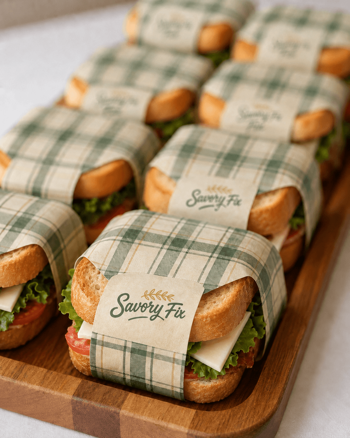
SAVORY FIX - MINI SANDWICH PACKAGING
SAVORY FIX - MINI DRINK BOTTLES
SAVORY FIX - MINI CHARCUTERIE BOX PACKAGING


SAVORY FIX - MINI CHARCUTERIE PACKAGING
SAVORY FIX - MINI SAVORY JAR
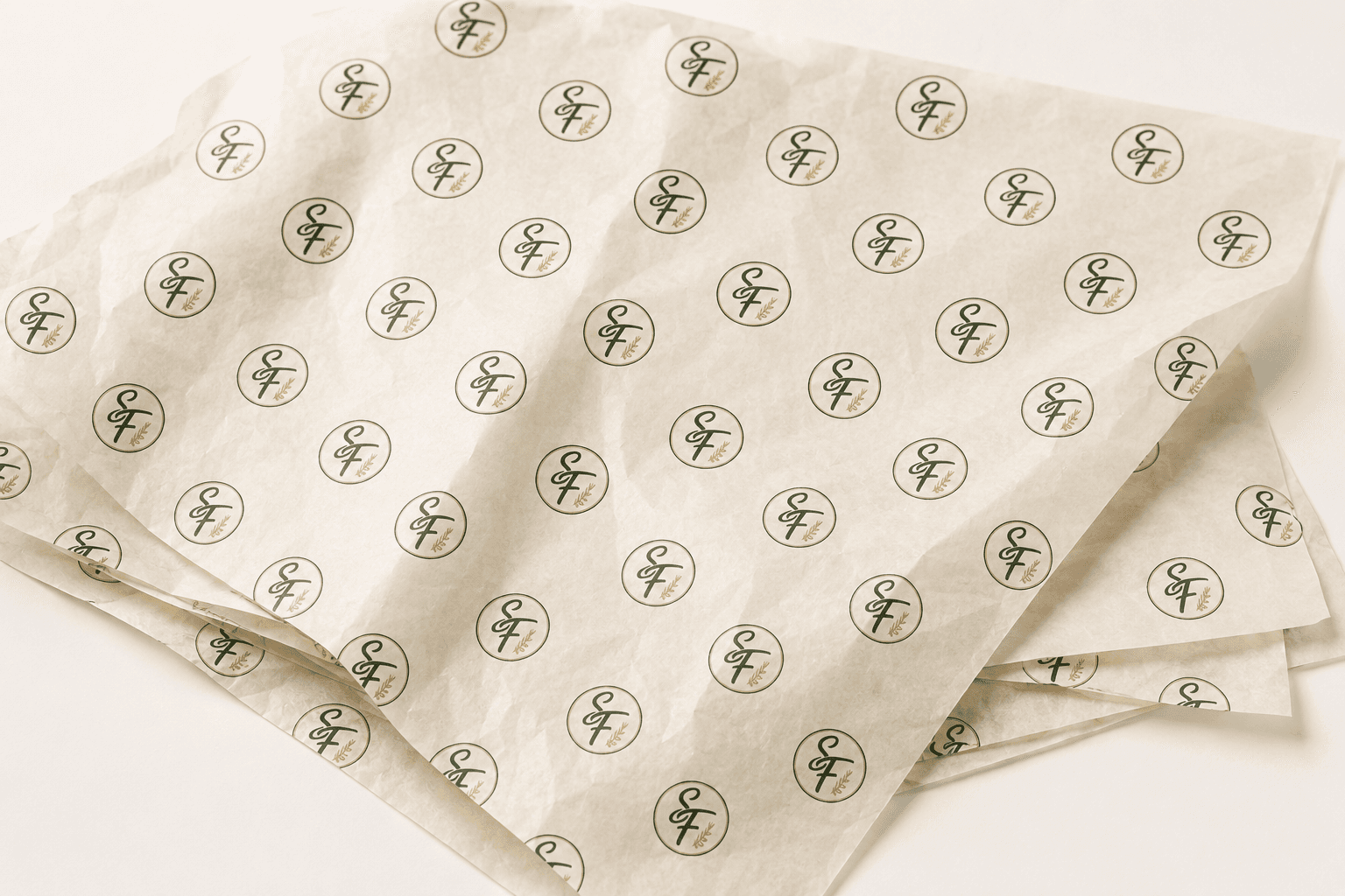
SAVORY FIX - TISSUE PAPER PACKAGING
SAVORY FIX - WOODEN UTENSILS



13 — Environmental experience
The Fix Truck
Designed for high-volume service, generous storage, and a complete mobile setup.
Ideal for festivals, concerts, corporate celebrations, community events, weddings, and large private gatherings.
counters · food truck · signage · trailer

SWEET FIX - FOOD TRUCK

SAVORY FIX - FOOD TRUCK

SWEET FIX - FOOD TRUCK

SAVORY FIX - FOOD TRUCK

SWEET FIX - FOOD TRUCK

SAVORY FIX - FOOD TRUCK

SWEET FIX - FOOD TRUCK AT WEDDING RECEPTION

SAVORY FIX - FOOD TRUCK AT A CORPORATE EVENT
The Fix Cart
Designed to create an elevated, interactive food experience while fitting comfortably inside event spaces.
Ideal for wedding receptions, galas, conferences, brand activations, office celebrations, and holiday parties.
counters · food cart · signage

SWEET FIX - FOOD VENDING CART

SAVORY FIX - FOOD VENDING CART

SWEET FIX - FOOD VENDING CART at CORPORATE EVENT

SAVORY FIX - FOOD VENDING CART AT WEDDING RECEPTION
The Fix Table
Designed for flexibility, easy setup, and beautifully styled service in more intimate spaces.
Ideal for showers, birthdays, brunches, meetings, pop-ups, cocktail parties, and private celebrations.
counters · food TABLE · signage

SWEET FIX - FOOD TABLE

SAVORY FIX - FOOD TABLE

SWEET FIX -TABLE AT A BABY SHOWER

SAVORY FIX - TABLE AT BIRTHDAY CELEBRATION
14 — Customer experience
Crave. Choose.
Order. Fix. Enjoy.
Five stages, identical on both sides of the store. The system is what makes two brands feel like one business.
Shared service journey
Stage 01
Crave
You already know the shape of what you want. You just haven’t named it yet.
Stage 02
Choose
Sweet or savory. The question is on the door, the ceiling and the home screen.
Stage 03
Order
Build it — flavor, toppings, sauces, extras. Every item has at least one decision in it.
Stage 04
Fix
Dine in, grab and go, or delivery. Both sides pack from the same station.
Stage 05
Enjoy
Points land, and the app already knows which side you lean. Until the next craving.
15 — Social media
A grid that
keeps asking.
The launch feed alternates sweet, savory, versus — on a fixed rhythm, so the profile reads as one
account with an argument running through it rather than two brands sharing a handle.
12-post launch grid

17 — Campaign
What’s your fix?
The campaign runs on contrast. Every execution pairs two cravings that have nothing in
common except that you’ve had both this week, then refuses to pick for you.
OOH · social · digital · delivery


SWEET FIX + SAVORY FIX -FOOD TRUCK EVENT CAMPAIGN
SWEET FIX + SAVORY FIX - POSTERS AT CORPORATE LOBBY


SWEET FIX + SAVORY FIX - POSTER OUTSIDE PARTY SUPPLY SHOP
SWEET FIX + SAVORY FIX - BILLBOARD AT SHOPPING CENTER
You don’t have to choose forever.
Just choose right now.
Campaign endline — billboard, transit, delivery sleeve
Billboards
Transit
Posters
Social ads
Digital banners
Delivery sleeves
18 — Merchandise
Pick a side.
Merch is where the dual brand becomes a personality test. Nobody buys a shirt for a food company — they buy one that says which kind of person they are.
Apparel · totes · pins · cups
SWEET FIX - TOTE
SAVORY FIX - APRONS
SAVORY FIX - TOTE
SWEET FIX - APRONS


SAVORY FIX - CHARCUTERIE BOARD
SAVORY FIX - T-SHIRT
SWEET FIX - CANDLE
SWEET FIX + SAVORY FIX - T-SHIRT


19 — Brand voice
Never describe.
Always tempt.
One rule: the brand never states a fact where it could name a craving.
Every system message got rewritten as something a person would actually say across a counter.
Copy system — UI, signage, packaging
Instead of
Order desserts here.
Say
Fix your sweet tooth.
Instead of
Savory foods available.
Say
Craving something serious?
Instead of
Your order is ready.
Say
Your fix is in.
Instead of
Thank you for your order.
Say
Until the next craving.
Playful
Direct
Craveable
Mischievous
20 — Applications overview
Six disciplines,
one brand world.
The full ecosystem the system had to survive. Every piece shown on this page comes out of one of these six.
Far beyond logo design
01
Identity
Two logotypes, SF monogram, badge lockups, one-color and knockout versions, small-scale rules, patterns, icon set and badge system.
02
Packaging
Dessert boxes, kraft board boxes, shake cups, sauce pots, wrappers, napkins, labels, wax seals, retail bags and the shared delivery bag.
03
Environment
Split storefront, ordering counters, menu boards, neon, directional graphics, pickup wall, packing station and the mobile events trailer.
04
Social Media
Instagram showcases the flavors, events, and branded experiences of Sweet Fix and Savory Fix while inspiring customers to find and book their perfect fix.
05
Campaign
The versus platform, endline, OOH, transit, posters, digital banners, delivery sleeves and the launch content calendar.
06
Merchandise
Apparel that makes people pick a side, totes, enamel pins, stickers, reusable cups and seasonal drops tied to the campaign.
21 — Design objectives
No invented
results.
A concept has no sales figures worth quoting. What it has is a set of problems it was built to solve
and whether the system actually solves them is visible on this page.
Concept — not a client engagement
Objective 01
Unify
Build one recognisable brand across two completely different food categories, so neither side has to explain its relationship to the other.
Objective 02
Differentiate
Give Sweet and Savory their own personalities without creating two disconnected brands that happen to share a landlord.
Objective 03
Engage
Turn the familiar question of sweet or savory into an interactive brand experience — on the door, in the app, and in the feed.
2
Cravings — two full personality
systems, built to stand alone
1
Brand — one script hand, one word,
one monogram, one voice
∞
Possibilities — the architecture takes
a third sub-brand without breaking
Sweet? Savory?
We’ve got a fix for that.
Sweet Fix / Savory Fix transforms a simple consumer choice into a complete brand experience using strategy, identity, packaging, environmental design and playful storytelling to build one flexible concept around the universal language of cravings.
Brand strategy • Creative direction • Identity • Packaging • Environmental • Digital • Campaign
One architecture.
Two appetites.
A self-initiated concept brand exploring how a flexible brand architecture can give two opposing product experiences their own personalities while keeping them part of one cohesive world. Strategy, identity, packaging, retail, UX and campaign — sole author, every phase.
Start the conversation
Sweet Fix / Savory Fix — concept brand
Shené Brownlee © 2026 · Imagine Reign Creative Studios
Back to top ↑